The Arbolado House
When I was offered the task of remodeling a dark 1960s home on Santa Barbara's Riviera, it raised red flags. Designing on the Riviera is never easy as neighbors tend to be extra sensitive about any changes to properties near them. But the clients are good friends and one of them is the world's greatest art teacher, so I ignored the flags and said yes.
Great clients make designing easy and with Annie and Paul deBruynKops, the journey was at least going to be pleasant. Same goes with having a great contractor, and the deBruynKops also wanted to use Upton Construction. The project ahead of us was not simple, because revisions in the municipal codes since the 1960's meant we needed to keep the new house on the basic footprint of the existing house. Without Upton Construction I would likely have passed on this difficult remodel.
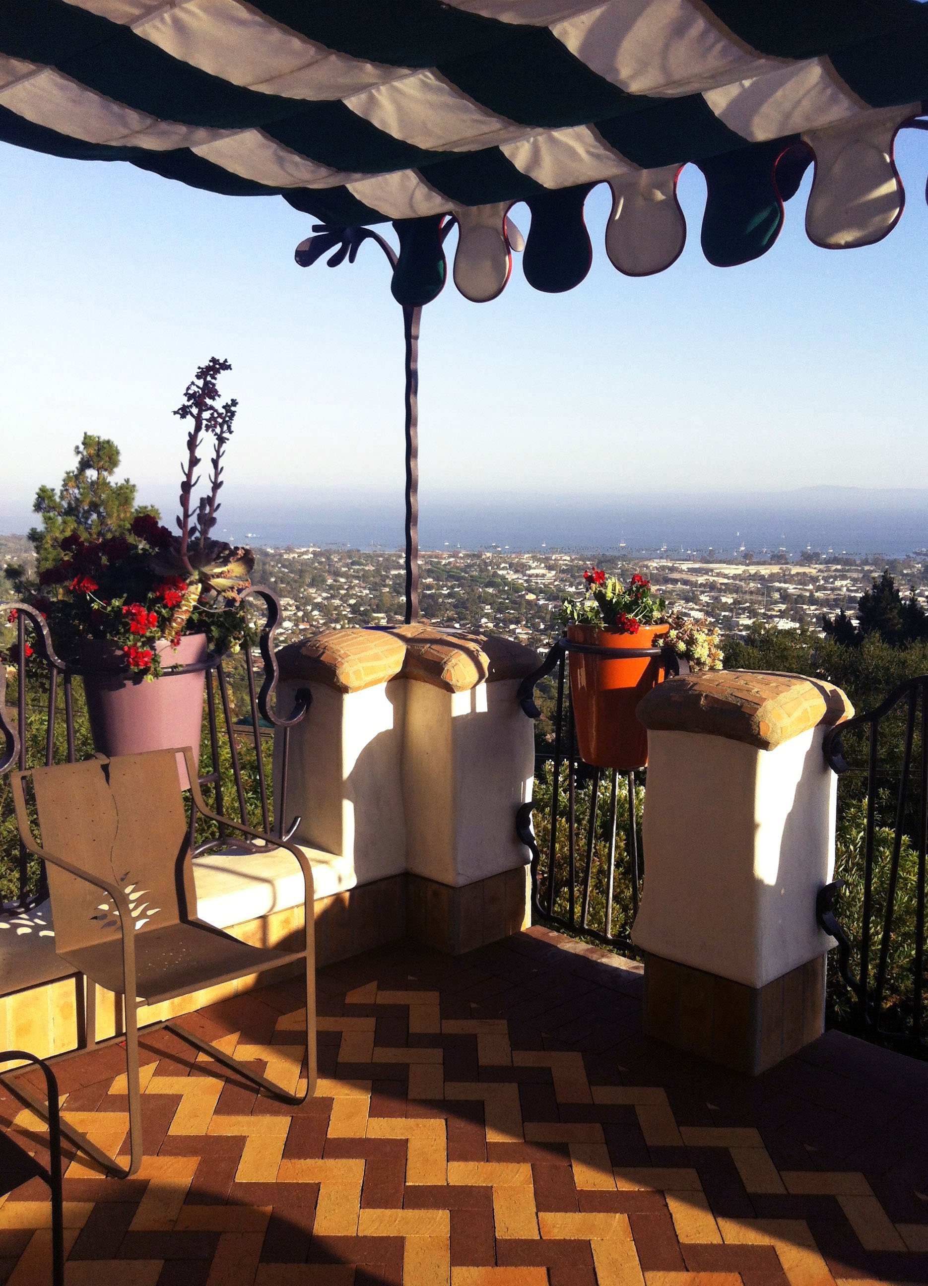
Backdropping the city on a series of steep foothills between the Santa Ynez Mountains and the Pacific Ocean, the Riviera is covered with homes tucked along winding roads amidst mature trees and sandstone outcroppings. Homes on the Riviera have spectacular views of the city and ocean below and this site was no different. But as is often the case on the Riviera, there were outcries from a few neighbors when the plans to remodel became known. Throughout the design and approval process, these same neighbors made it clear they thought we were going to ruin the neighborhood and their investments, and in one case, their lives. The project was delayed for a year as we fought the idea that the house didn't fit the neighborhood. Once it was completed, it seemed to only receive compliments.
The only resemblance of the new house to the previous one is the basic footprint. The original house was torn down, and we designed the new home to be one story so that neighbors had a view over the top. We placed the master bedroom on a second floor up against a grove of existing trees so as not to affect a view corridor.
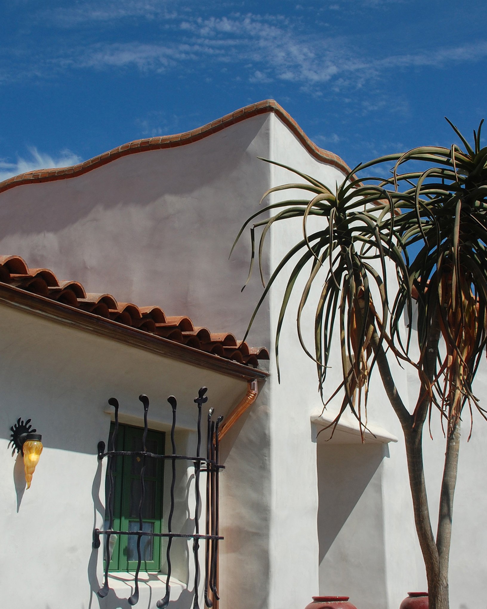
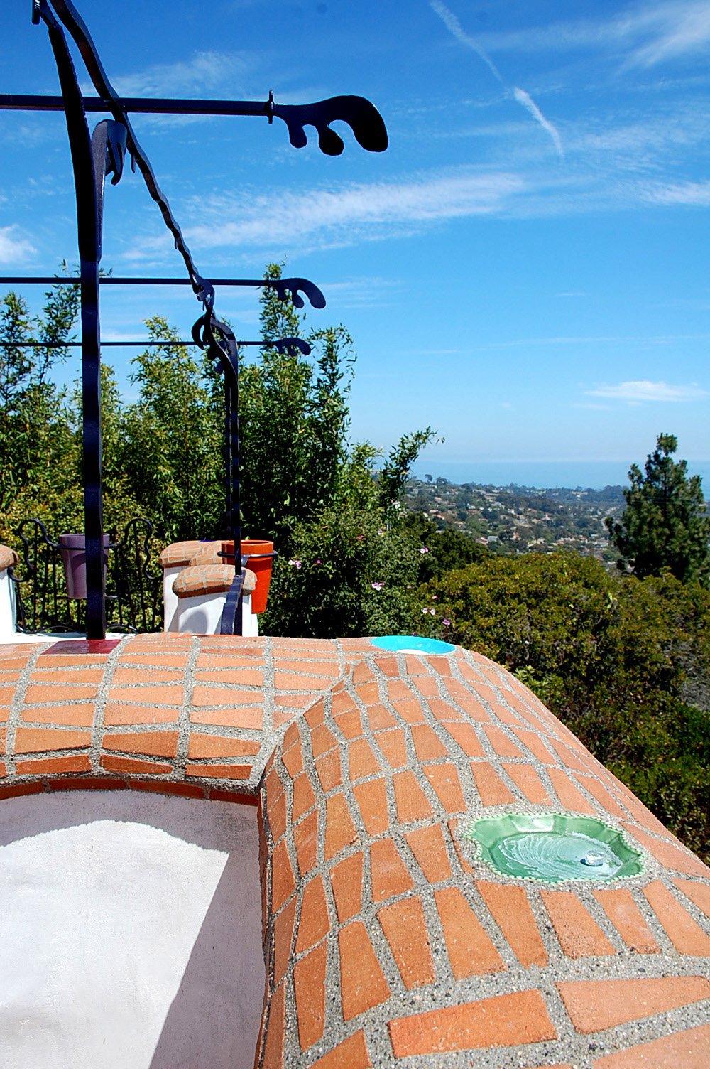
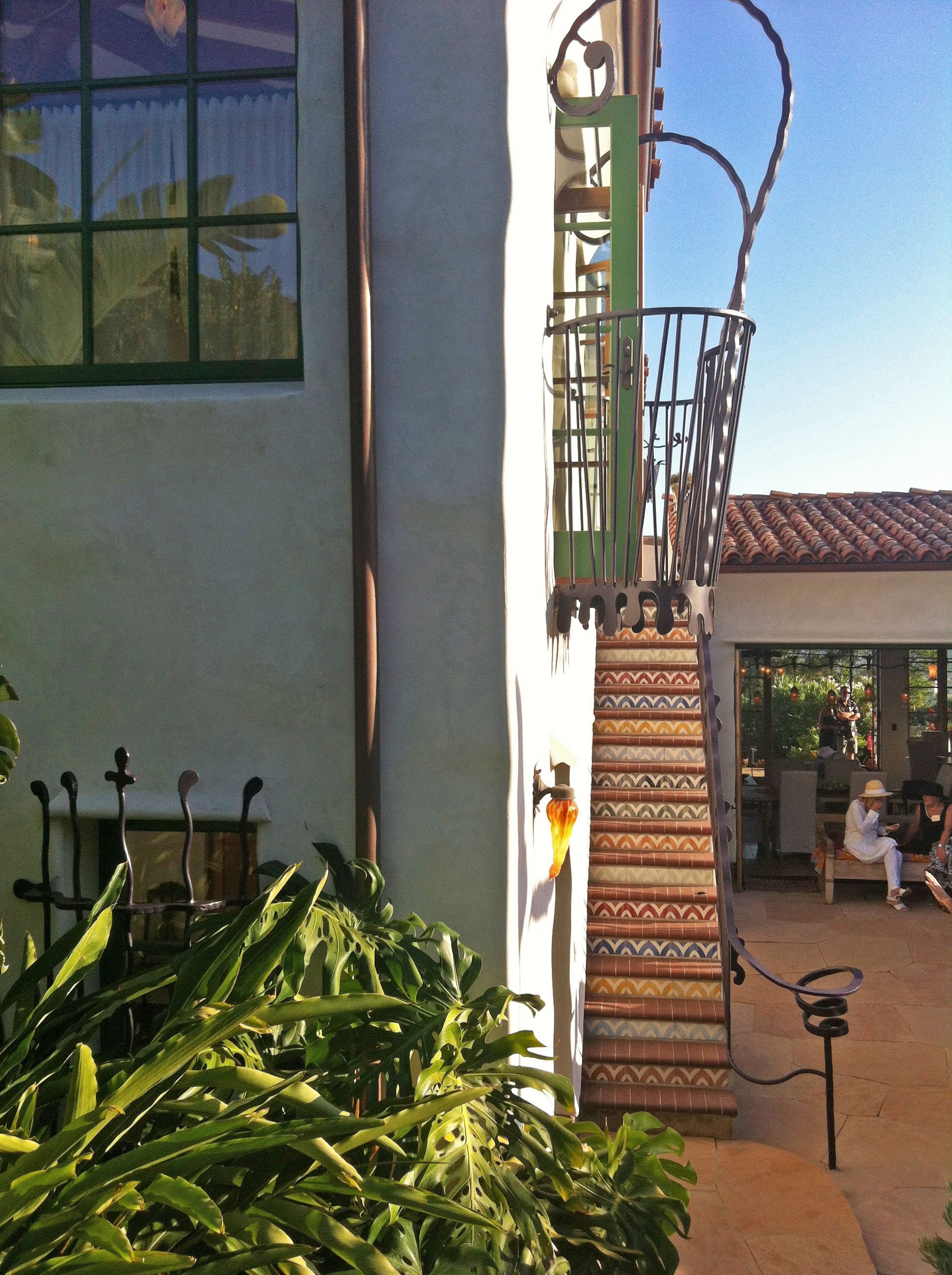
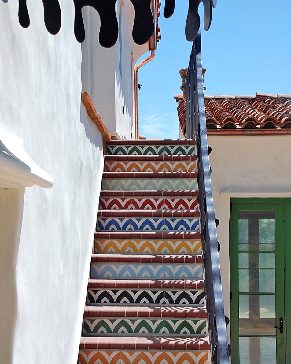
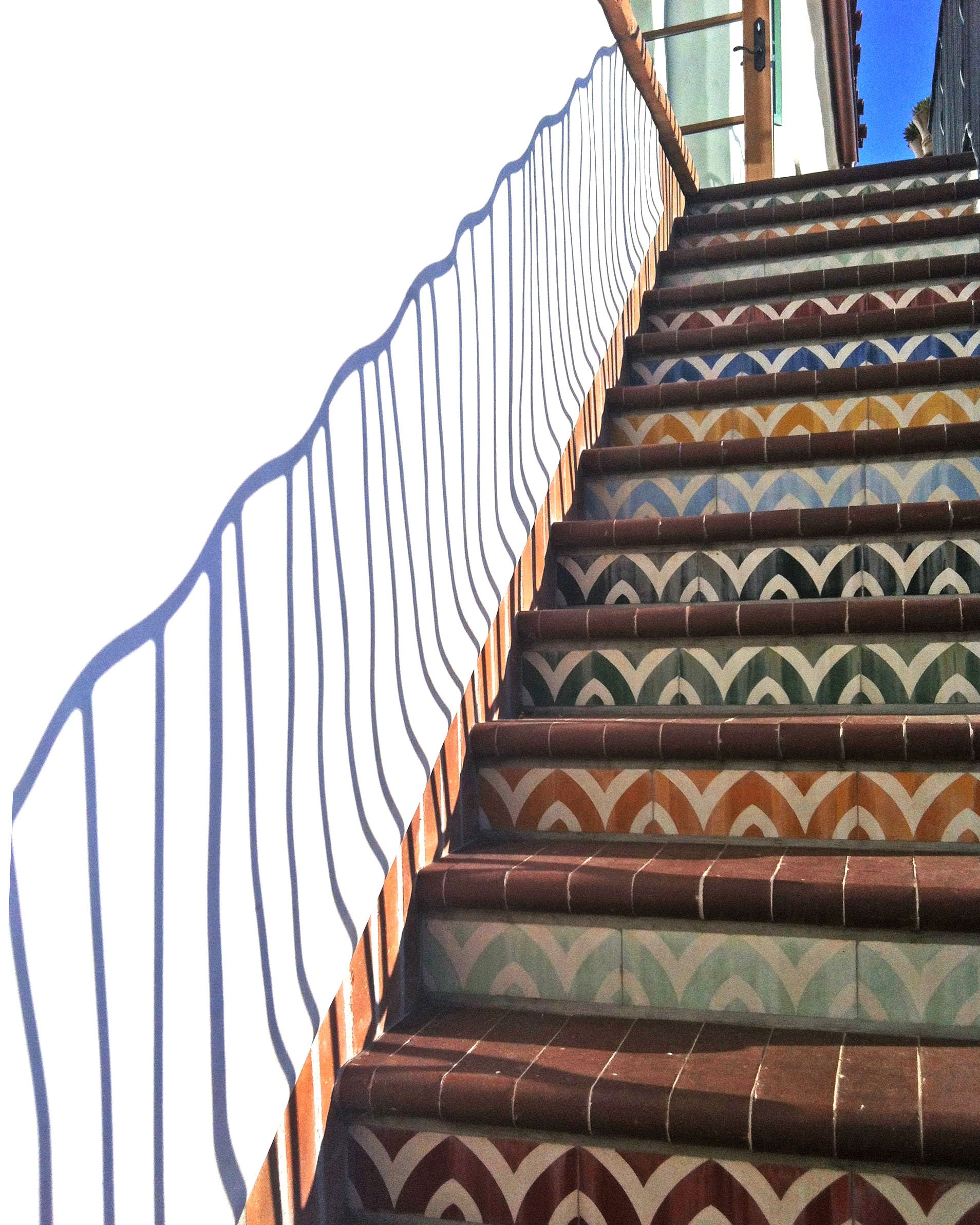
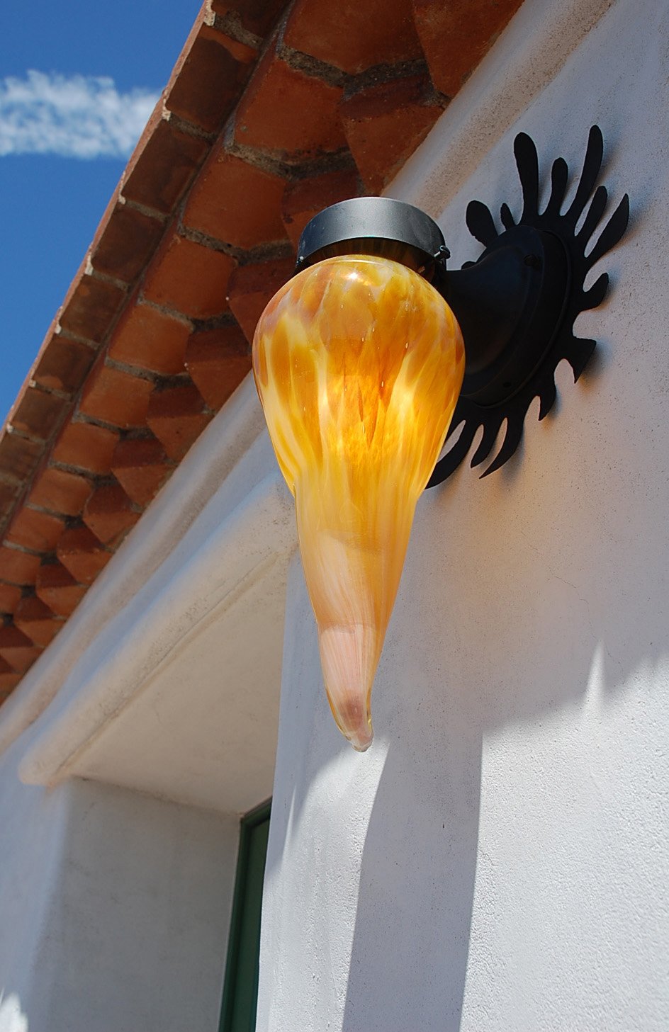
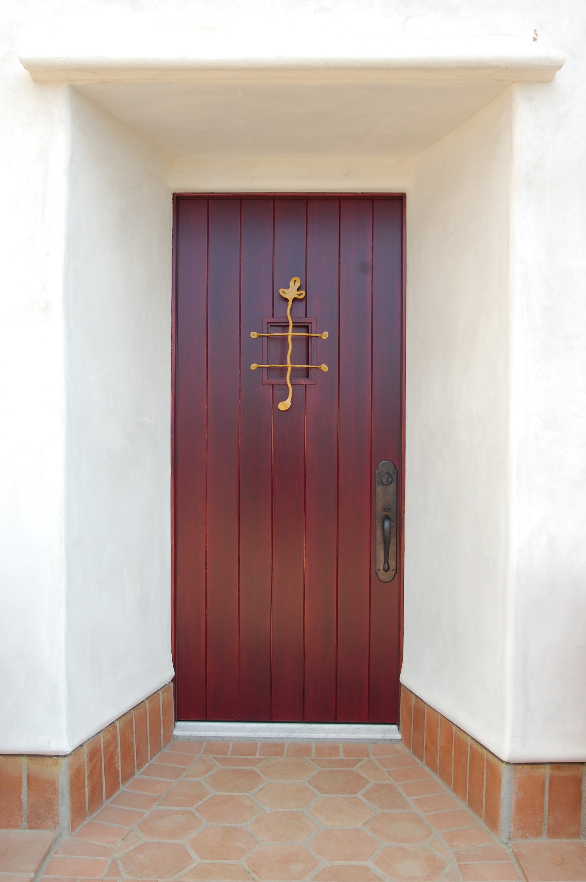
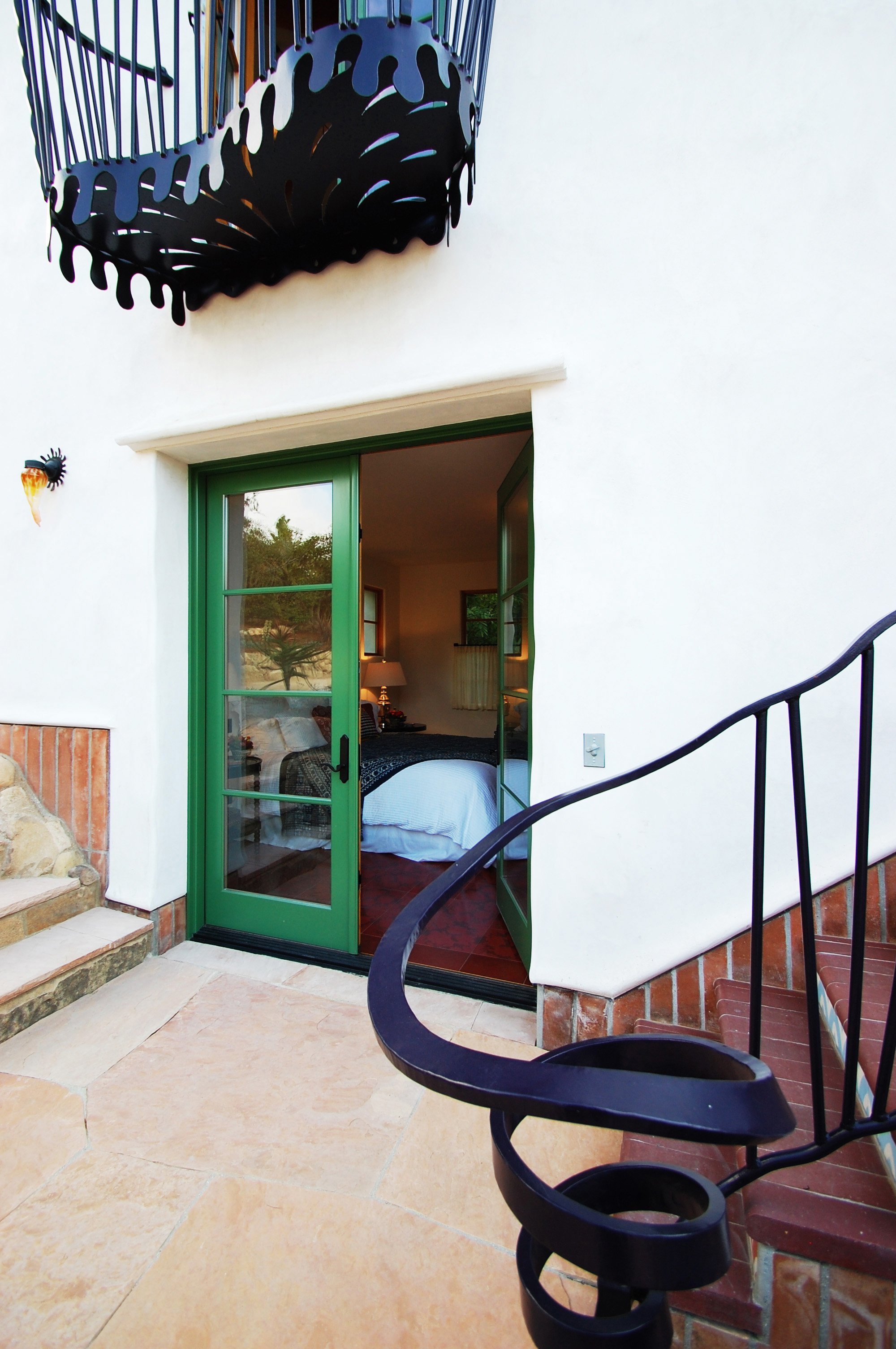
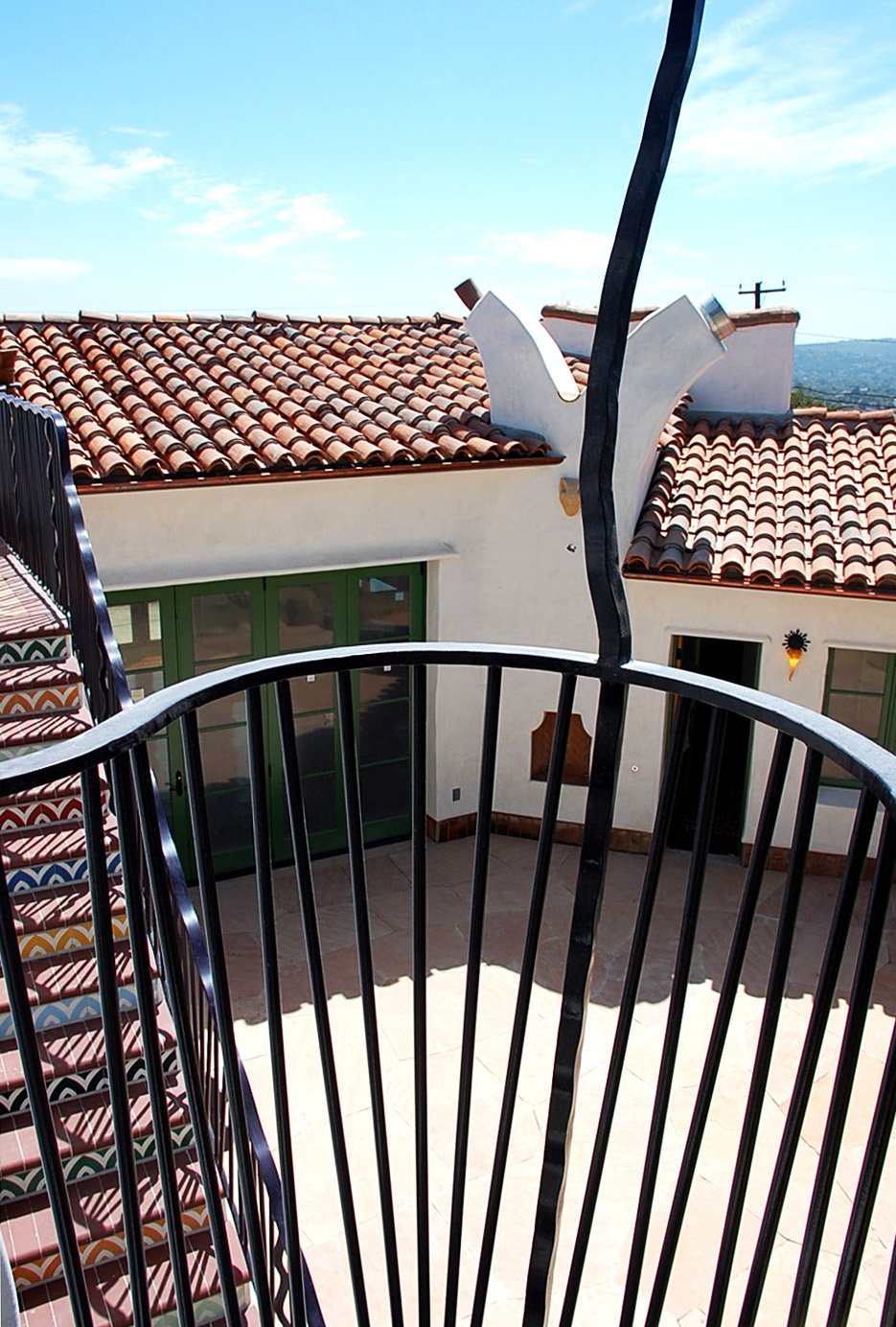
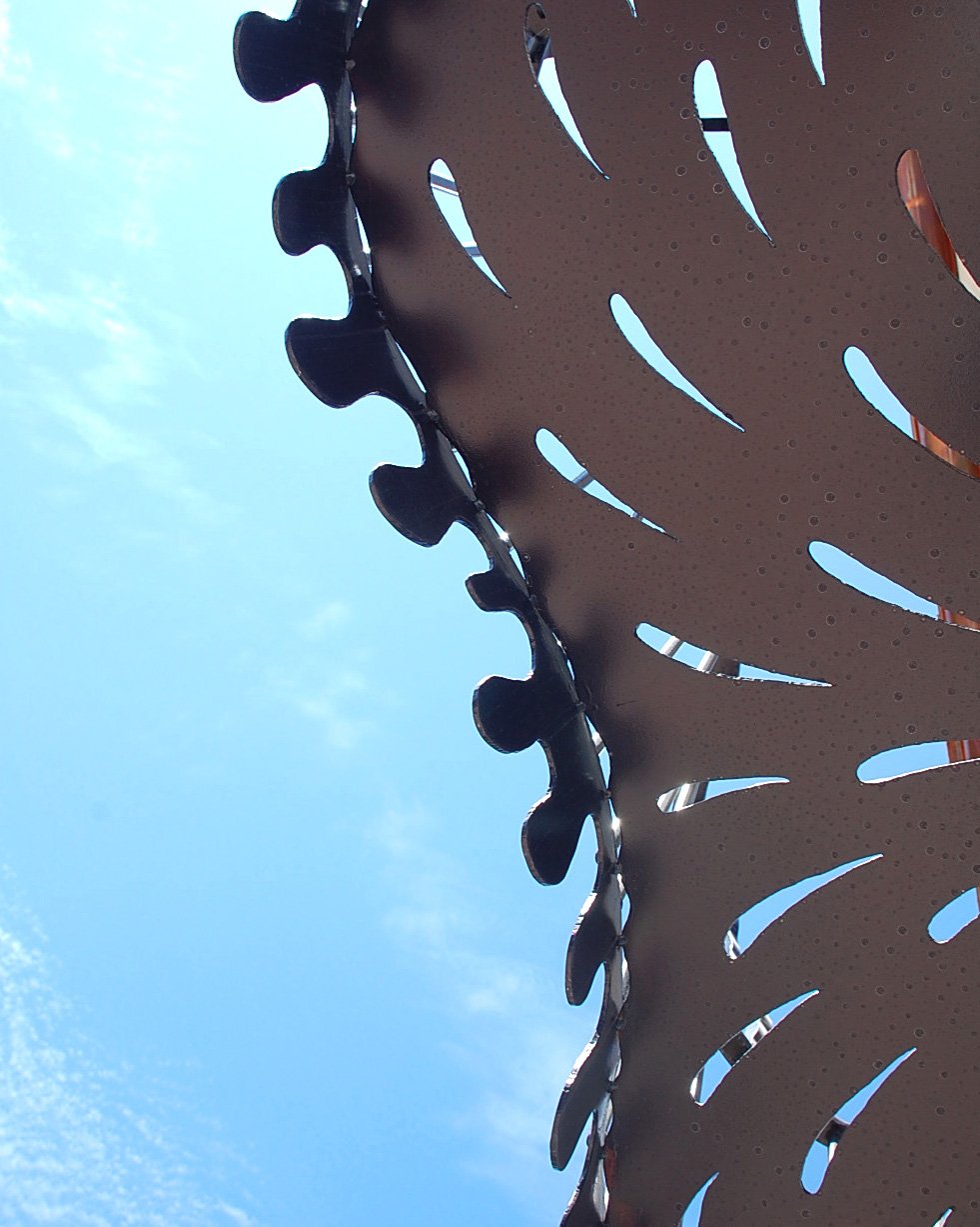
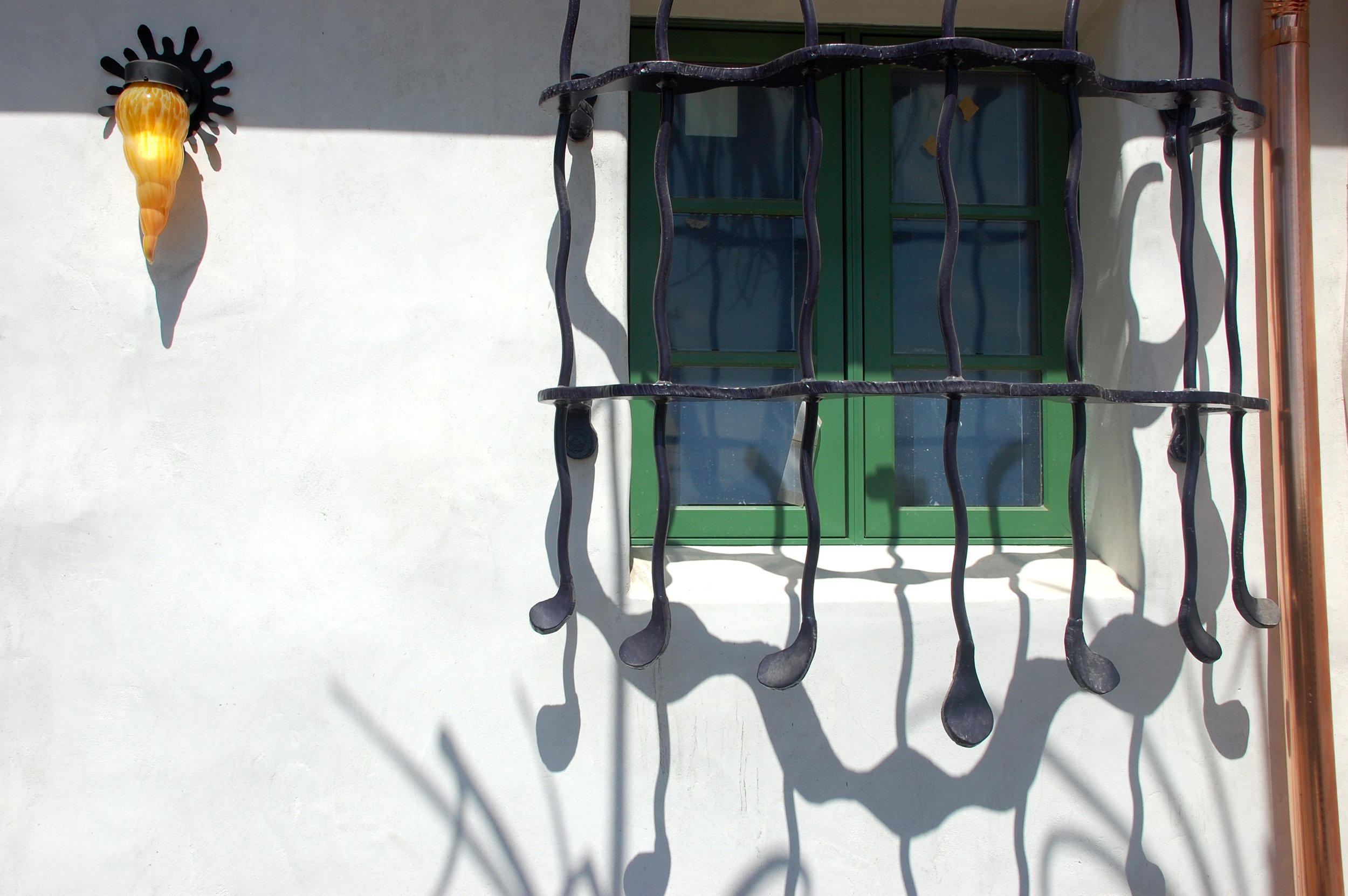
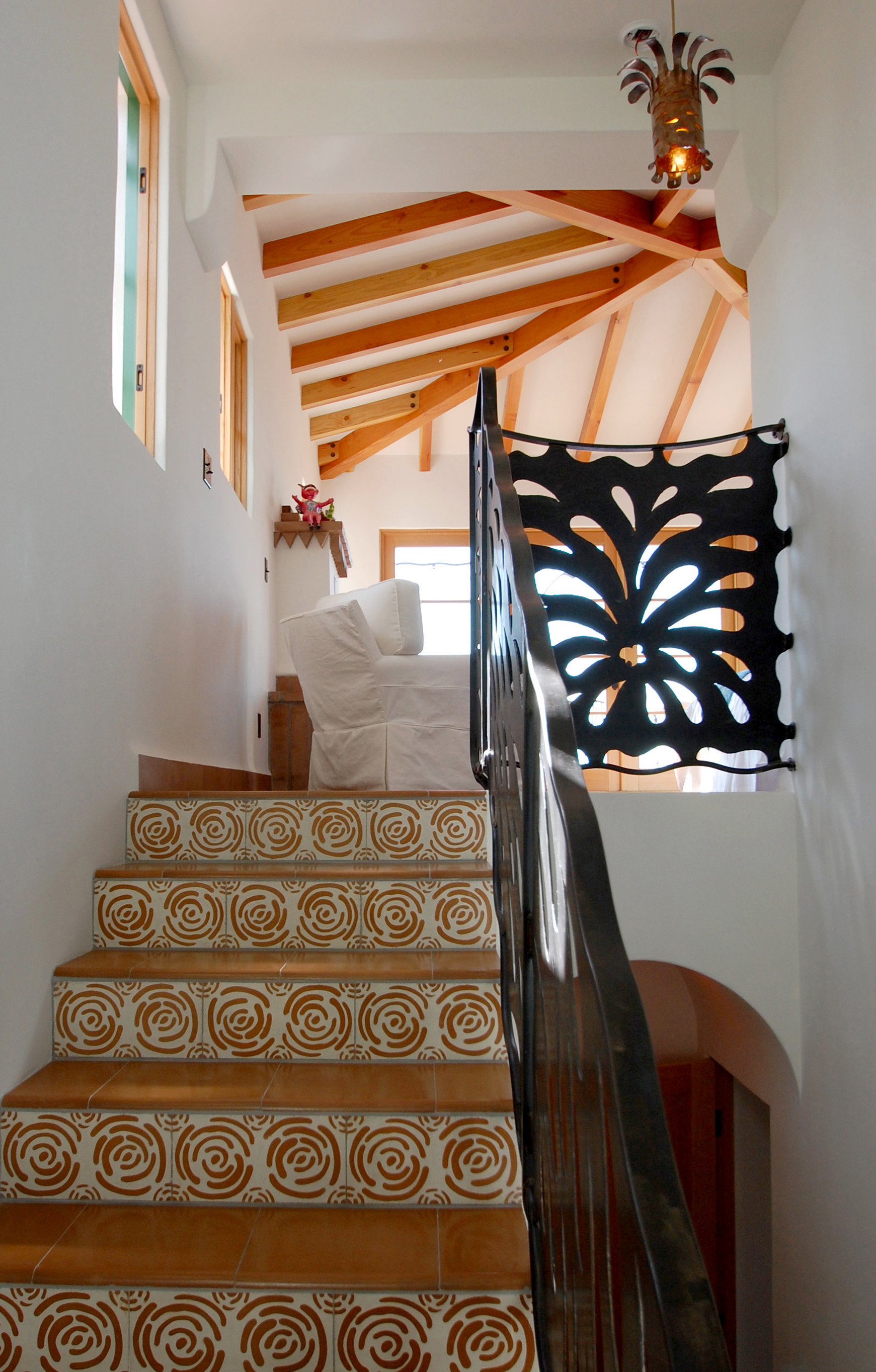
The project's fabulous foreman, David Kruger, kept construction on track with his meticulous eye for detail. David Shelton and his shop created the ironwork, making the nature of the design fairly simple in keeping with the old 1920's houses on the Riviera. Saul Alcaraz created hand-blown glass shades and sconces for both exterior and interior lighting, and Tom Cole created the lush Aloe and succulent landscape.
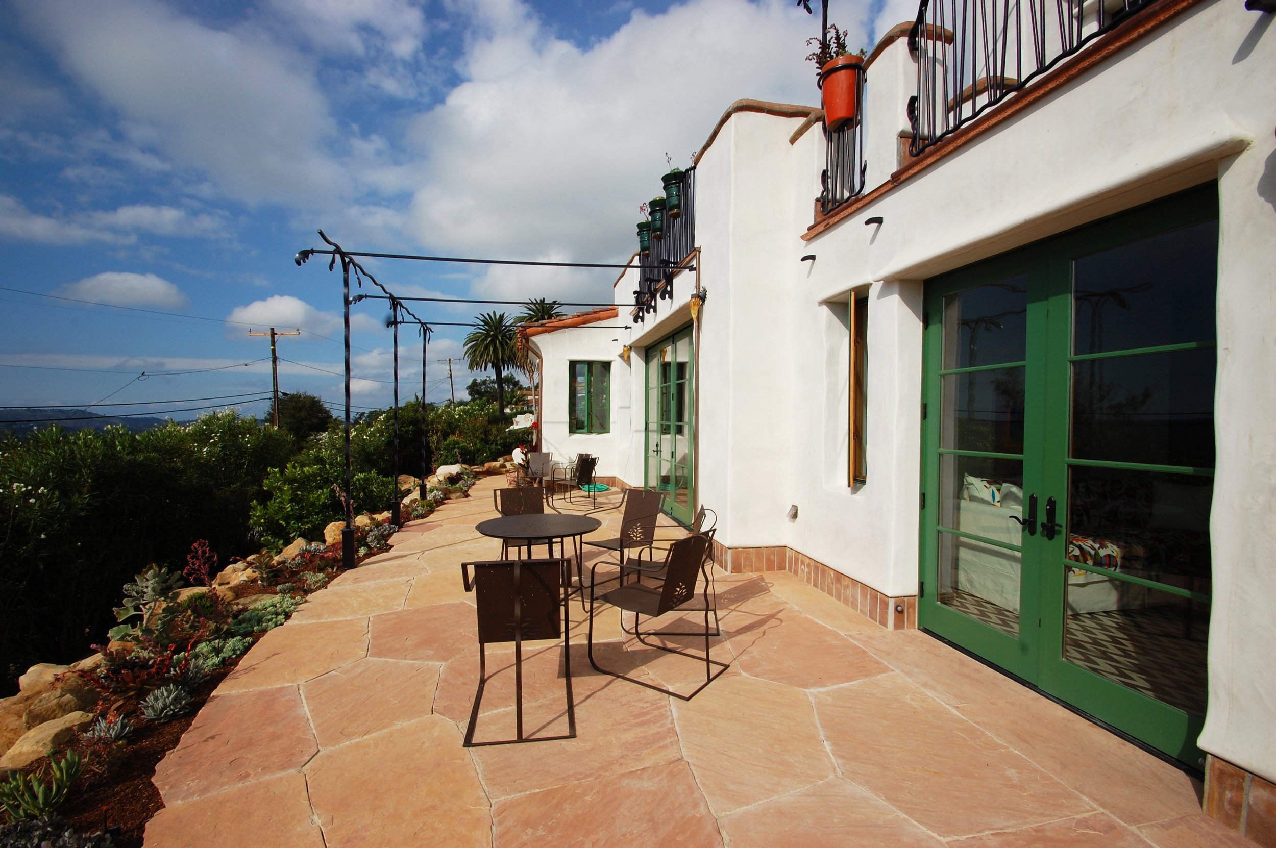
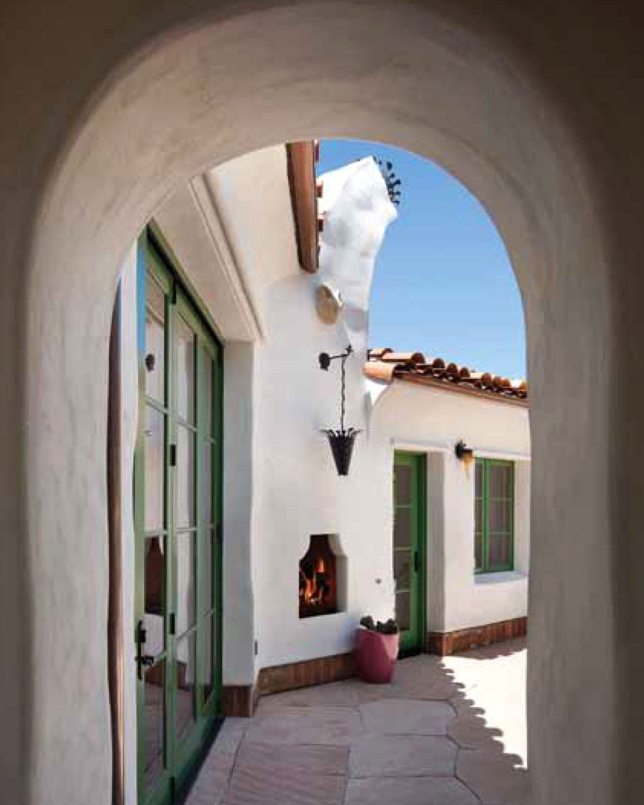
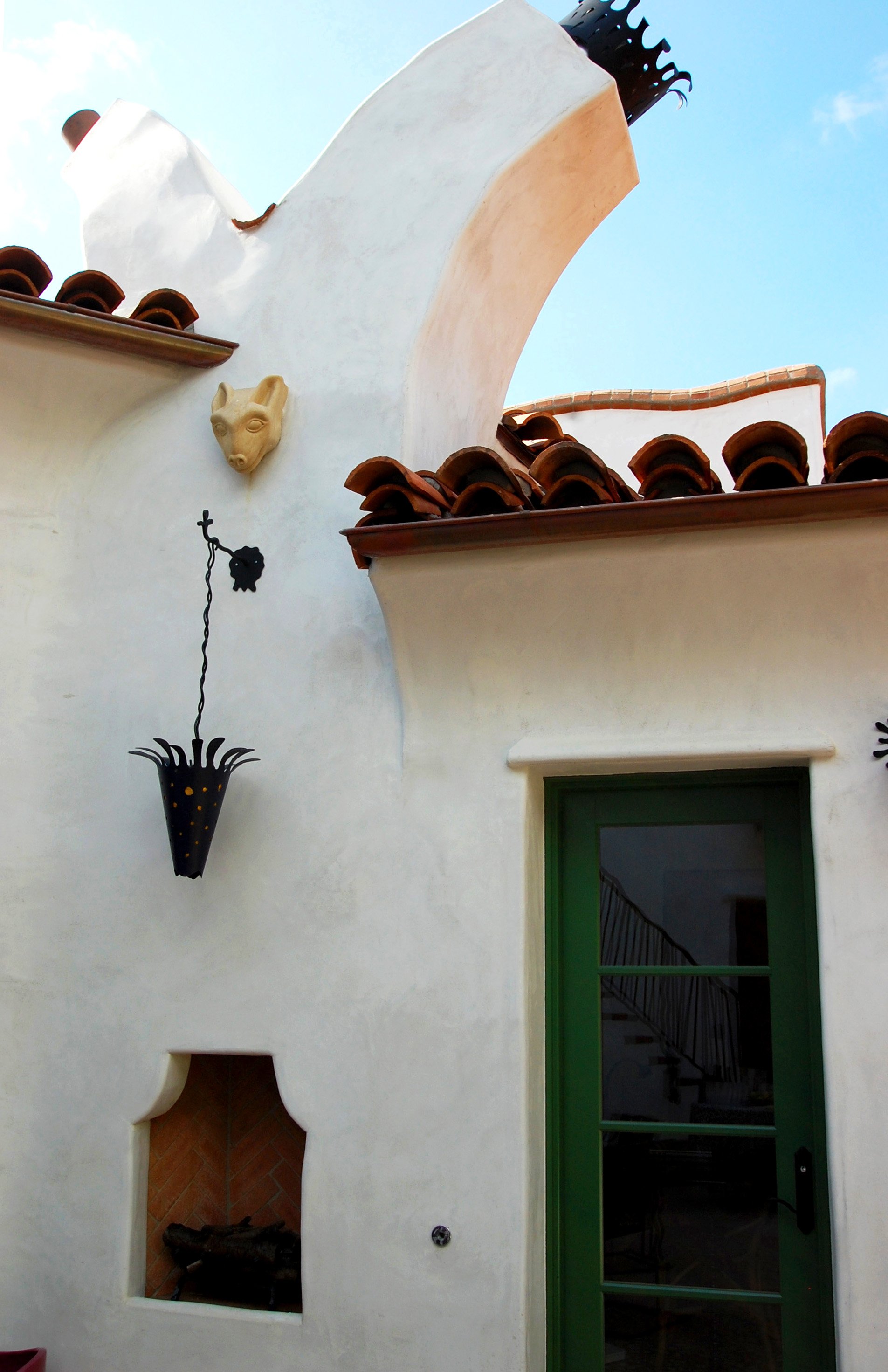
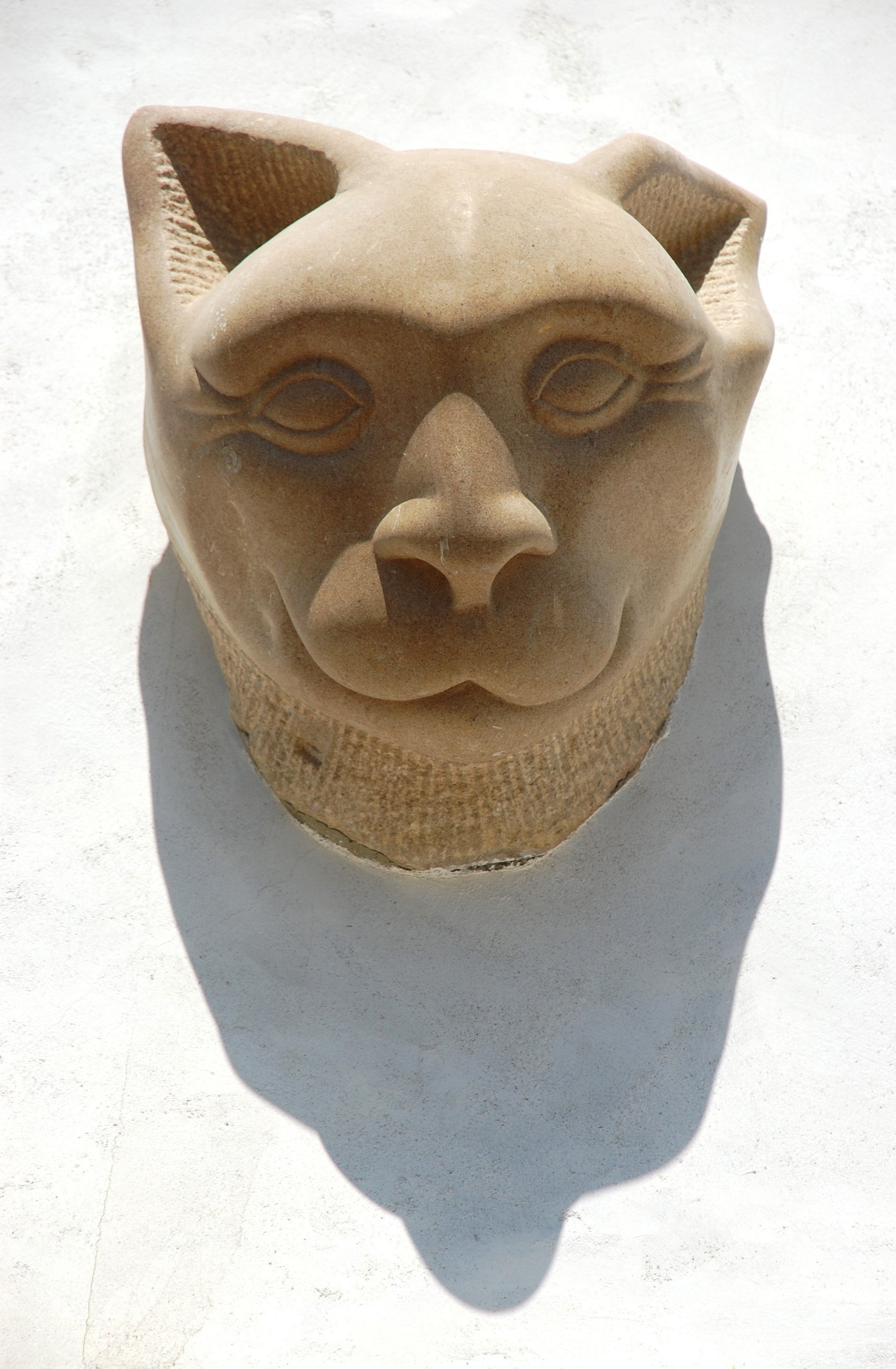
Anders Johnson carved the limestone creatures embedded in the plaster over the entry and the back patio. He also carefully selected the flagstone for the patios, designed and installed them. Rule number one with AJ is never to tell him what to do, how to do it, or when to do it. He and his helper Wilder would show up at 9am and start ranting in English, Spanish and a few words in Japanese, that everyone needed to be tidier, and then they would start raking and hosing down the premises. They'd go to work for awhile, take a long lunch, play some gin rummy, smoke some clove cigarettes, get back to work at 1pm, work until 3:30 (if we were lucky) all the while not using a level or a tape measure, but only fingers to measure the flagstone cuts and a well-trained eye and intuition to understand patio drainage, while all along frustrating David Kruger who just wanted to know what the schedule might be, a reasonable request. David always showed up first at 6:30 am and actually liked using tape measures and laser levels. David could barely watch Andy do his thing, and Andy stormed off many times at 11am instead of stooping to using a level. Once, David brought out a level to check AJ's work and AJ got into his truck and didn't return for a week. One of my great joys in life has been working on projects with AJ and watching other people have to climb into his world order.
Eventually David Kruger, Dan Upton and the crew completed the house, and Anders Johnson completed the beautiful patio, and it drained perfectly.
Photo Credit Jim Bartsch
Photo Credit Jim Bartsch
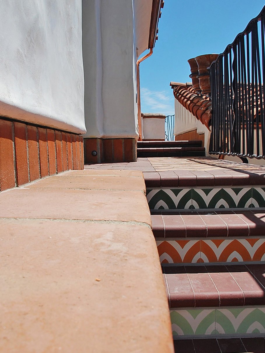
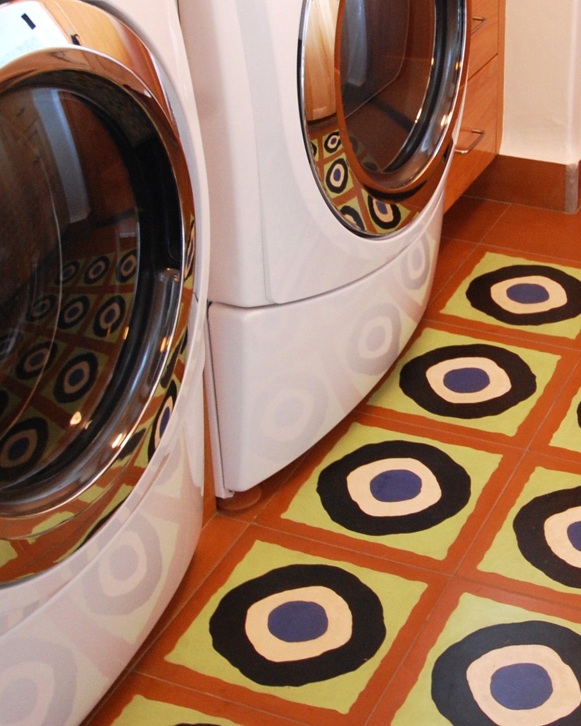
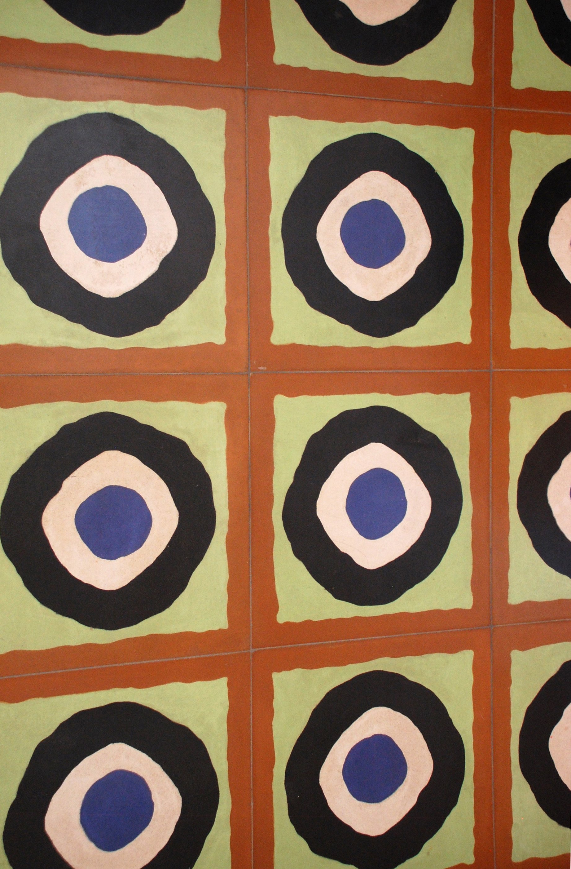
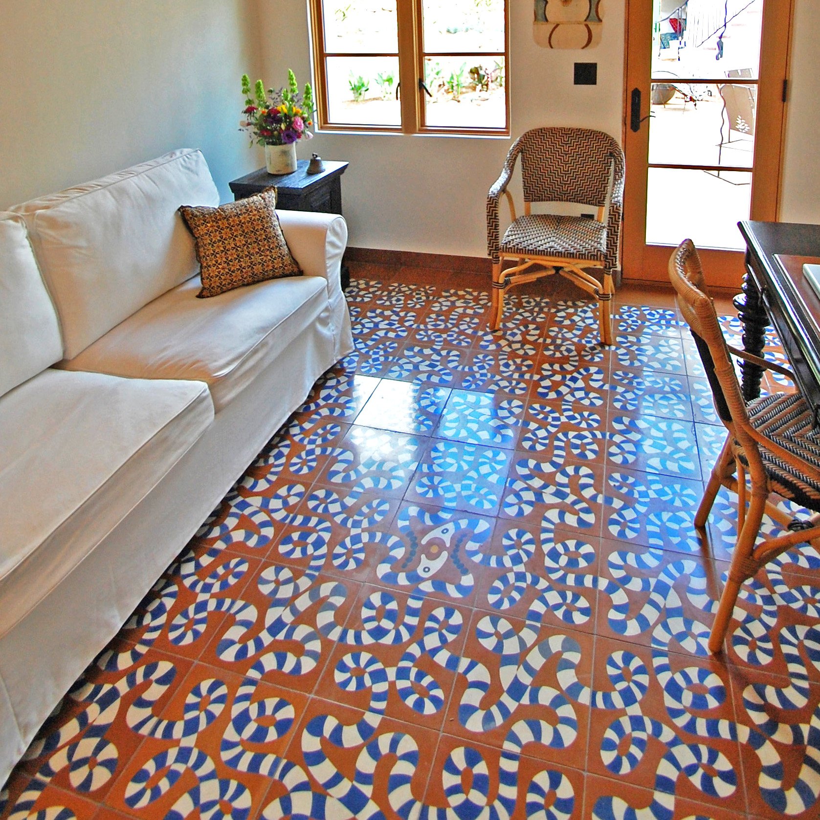
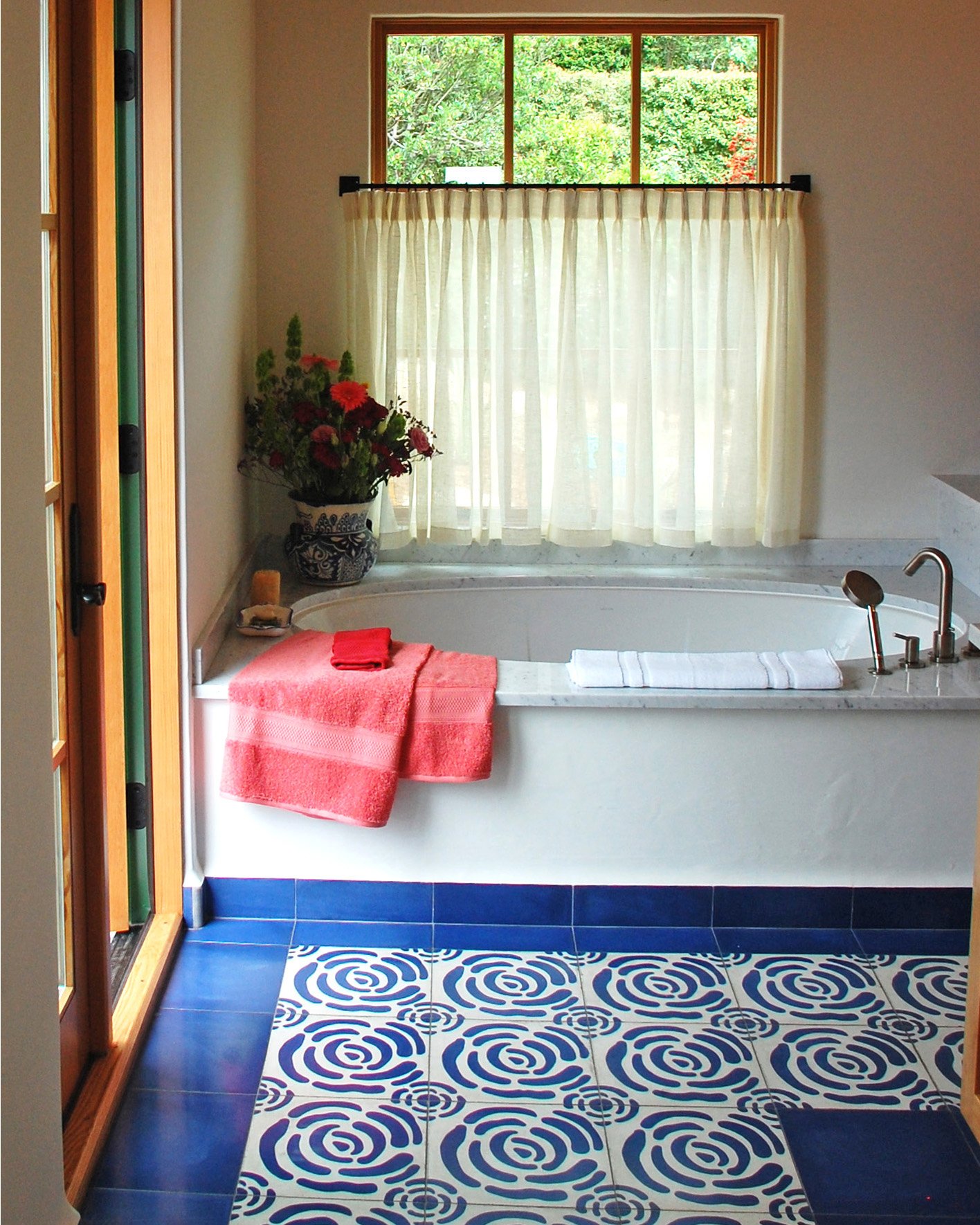
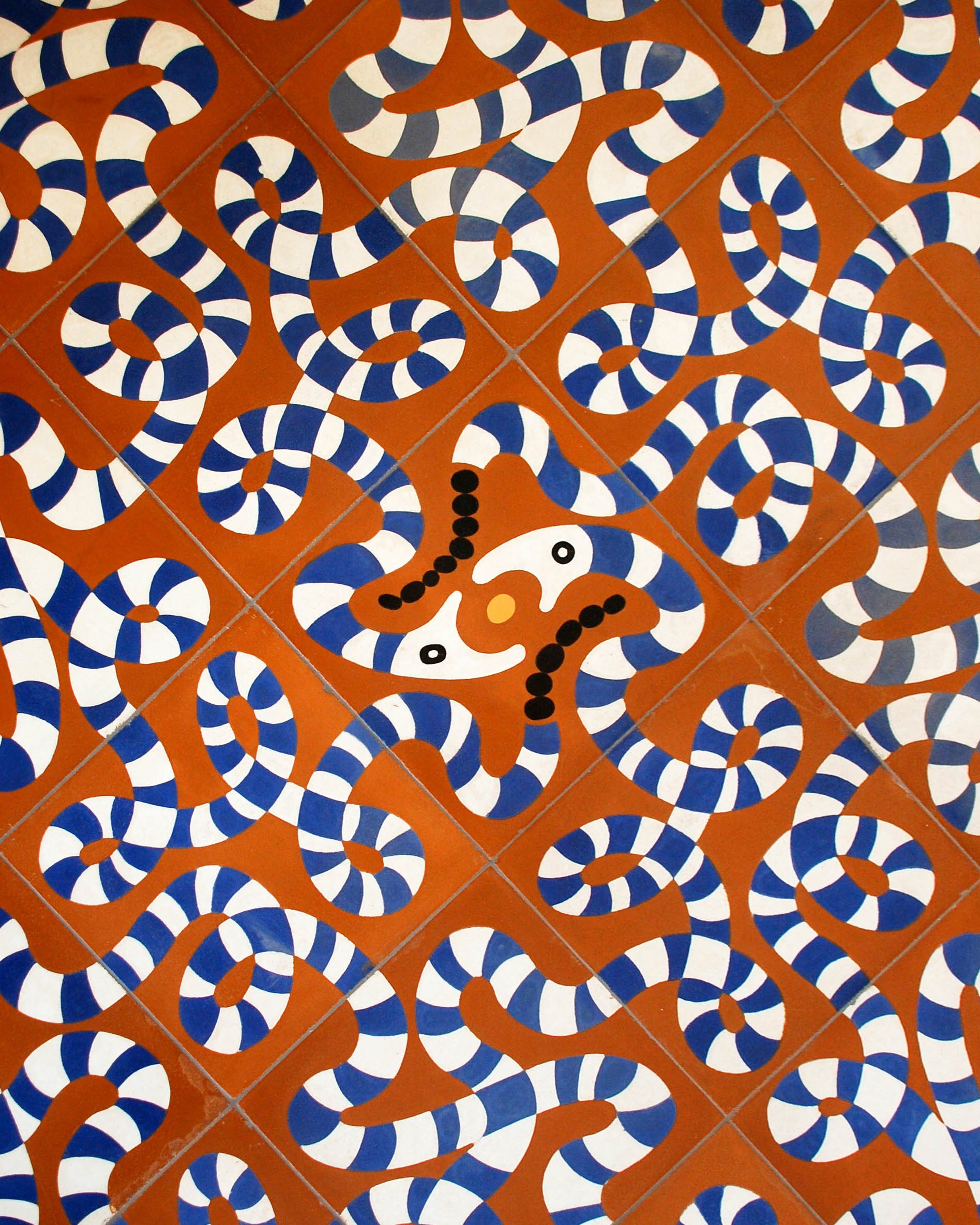
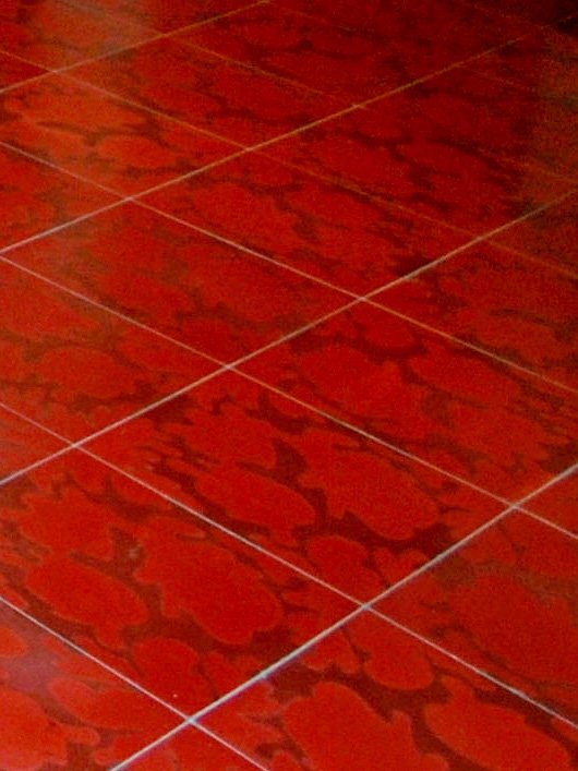
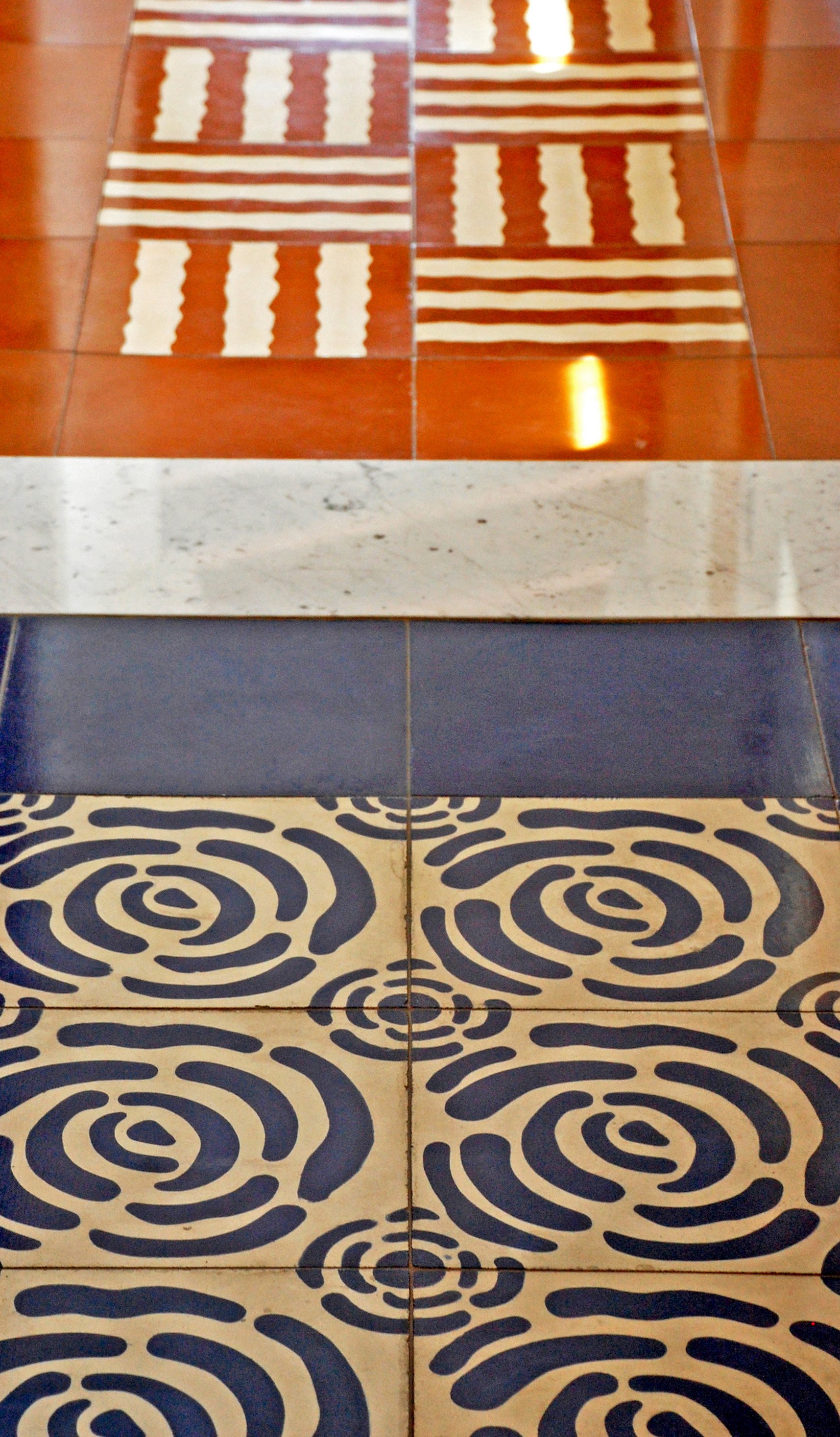
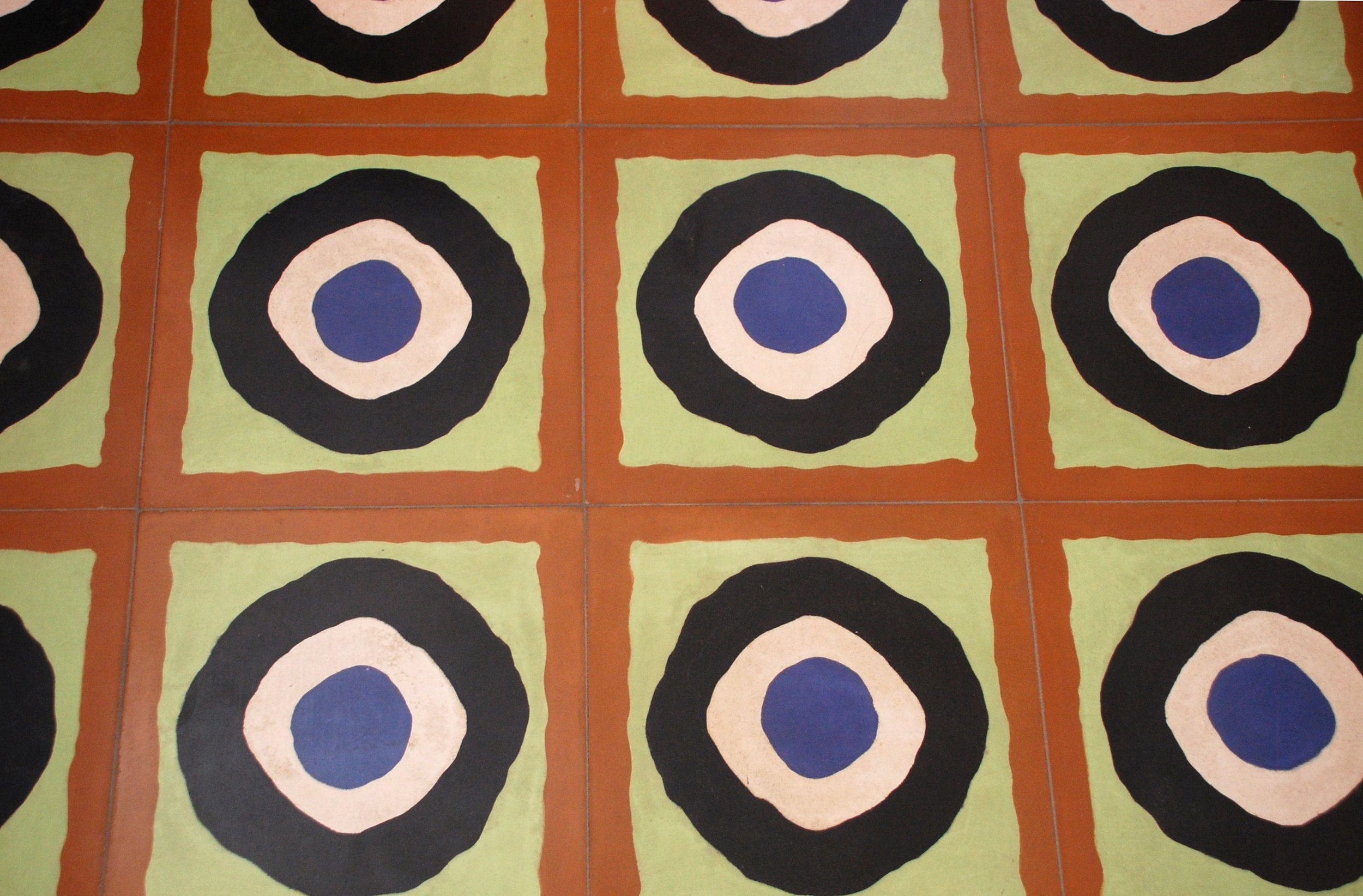
Annie and Paul filled the house with cement tile. Luckily Annie helped select the colors, and the result was the best color palette I have ever had on a project. The dark red and red color combo in the"Oil Spot” floor tile is still one of my favorite tiles, thanks to her. Paul was smart and let Annie pick the tile and colors. He did, however, select the Snake Tile for his office. And the two of them together had the sense of humor to select Circle Tiles in the laundry room to match the circles of the washer and dryer doors.
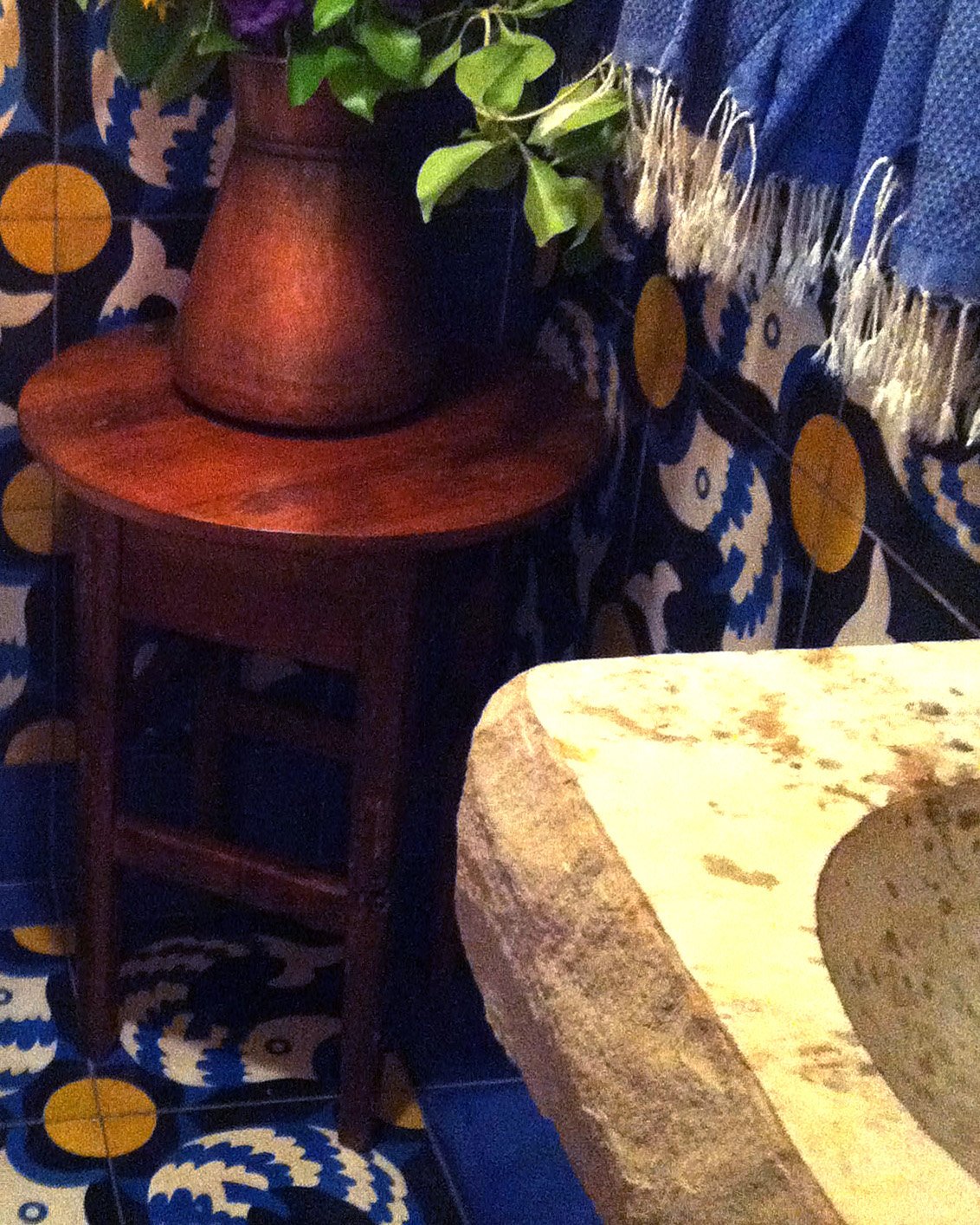
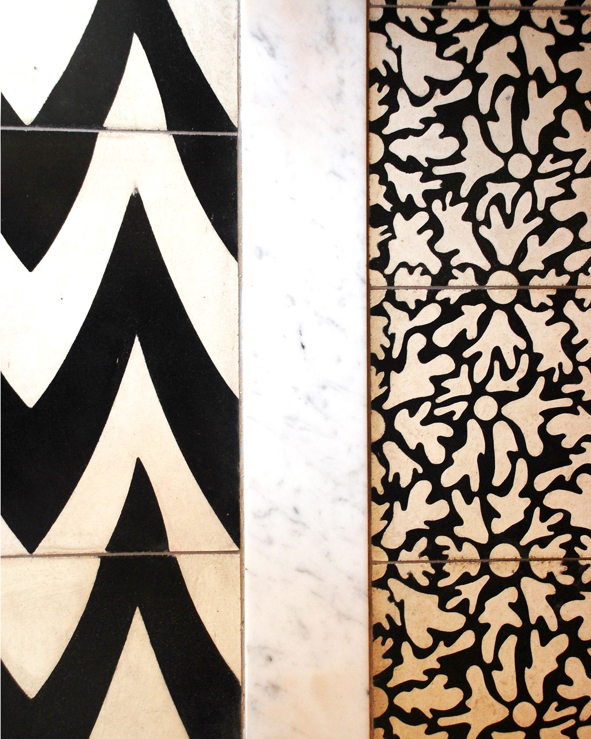
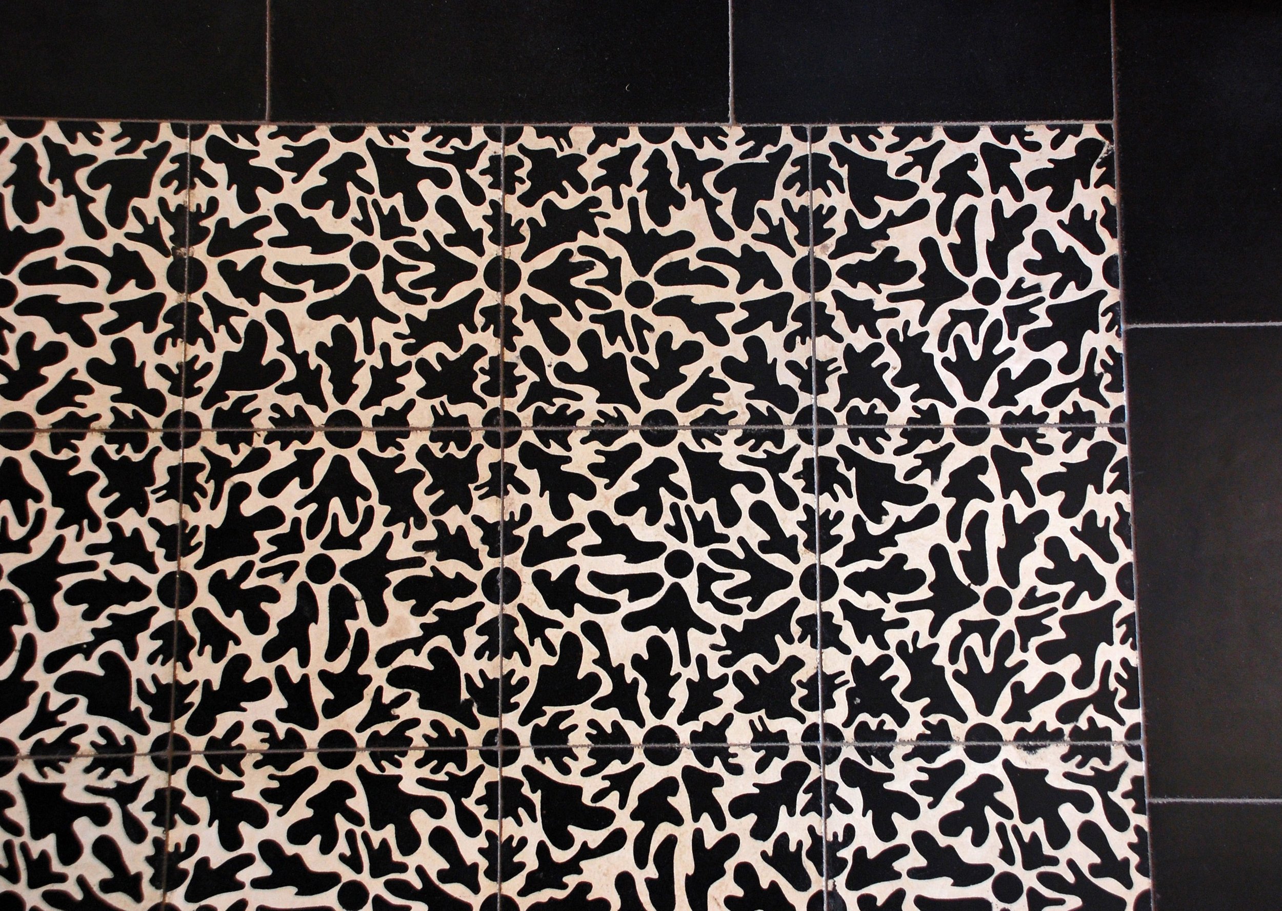
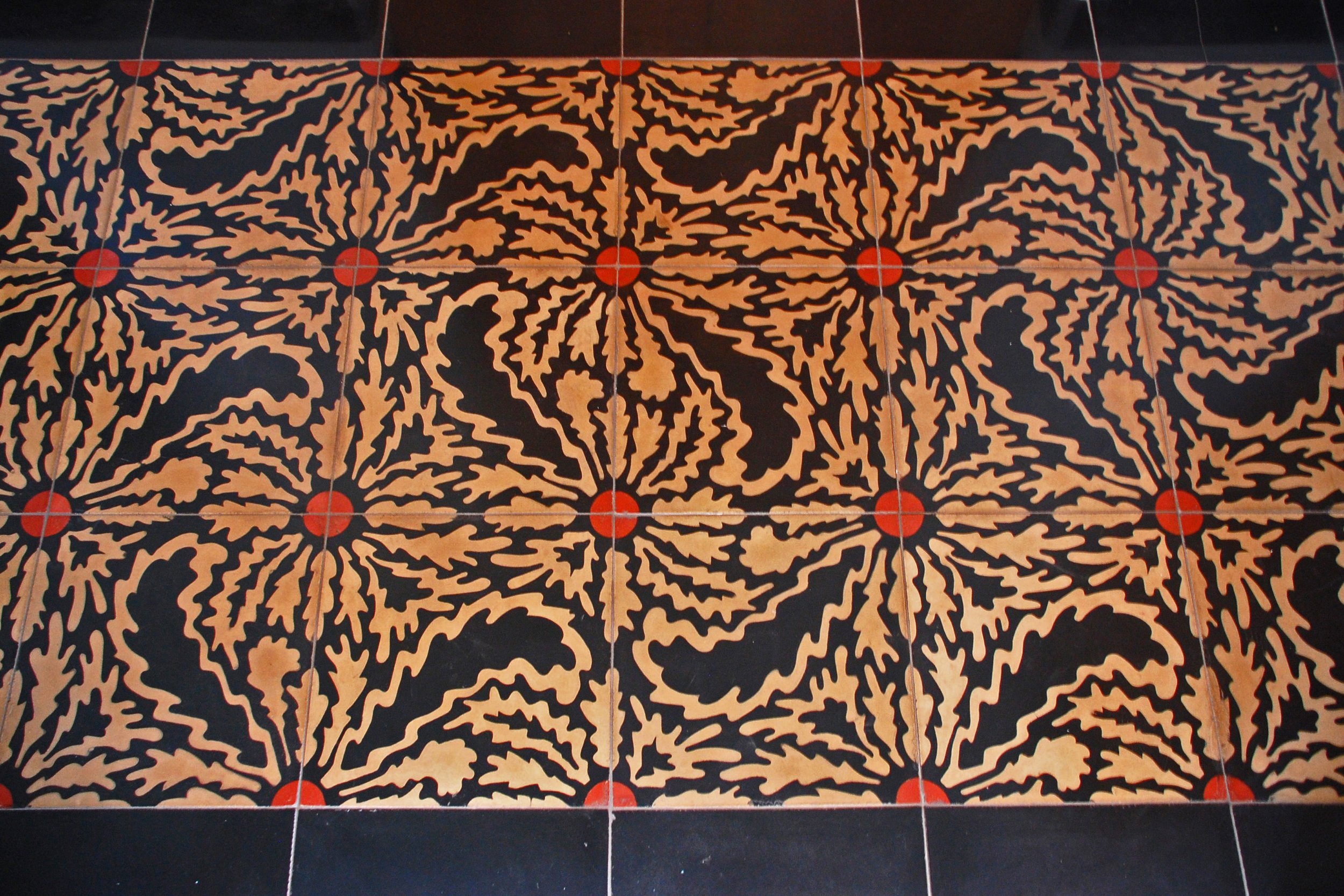
Because we had to keep the existing garage exactly where it was, I needed to create two new tile designs to help disguise the slightly awkward room configurations and space relationships that resulted. The tile patterns were named after the owners, “Annie’s Flower” and “Paul’s Flower" and both have been used in several subsequent projects, as the asymmetrical small flowers make seams and angled cuts unnoticeable.
Photo Credit Jim Bartsch
Photo Credit Jim Bartsch
Photo Credit Jim Bartsch
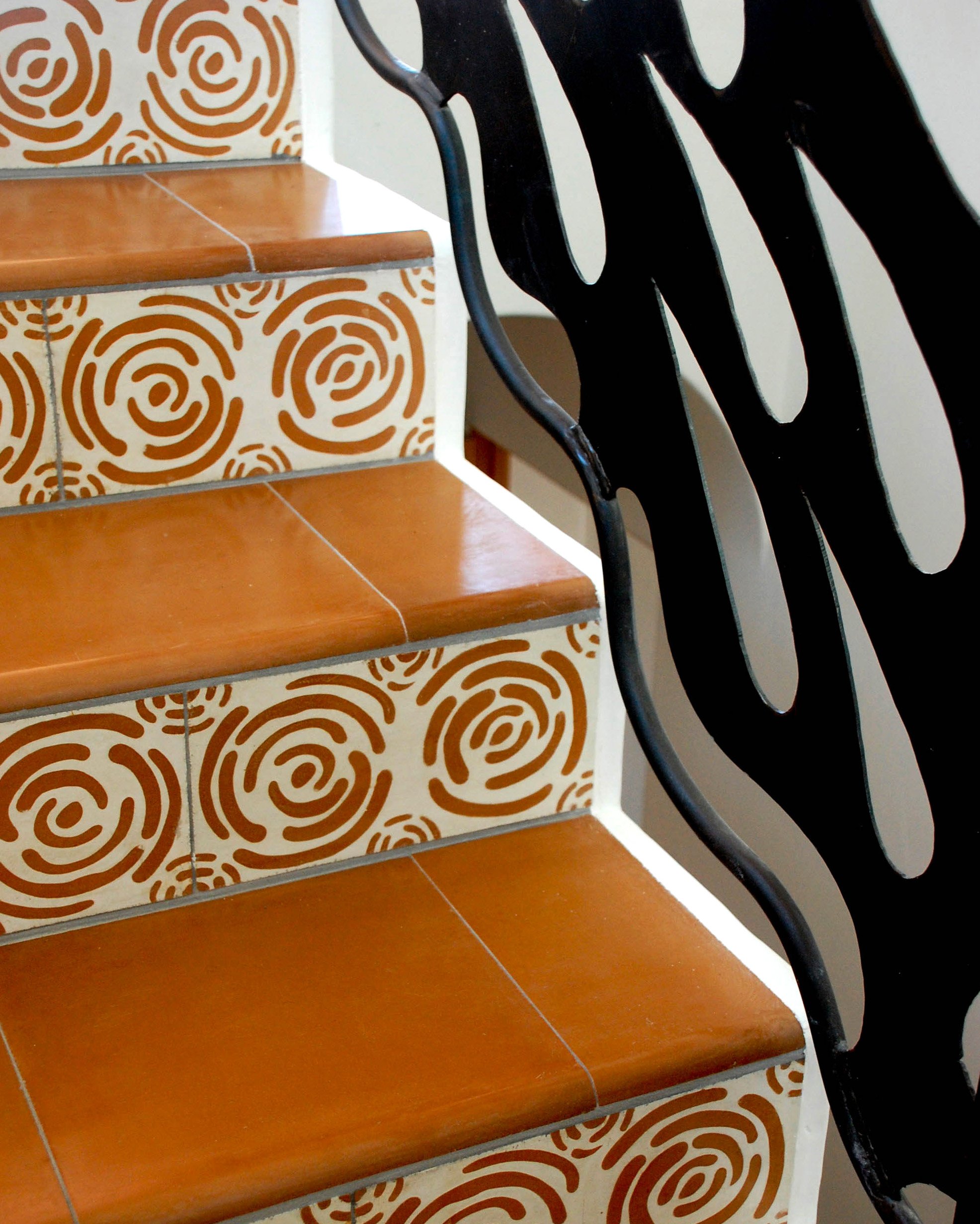
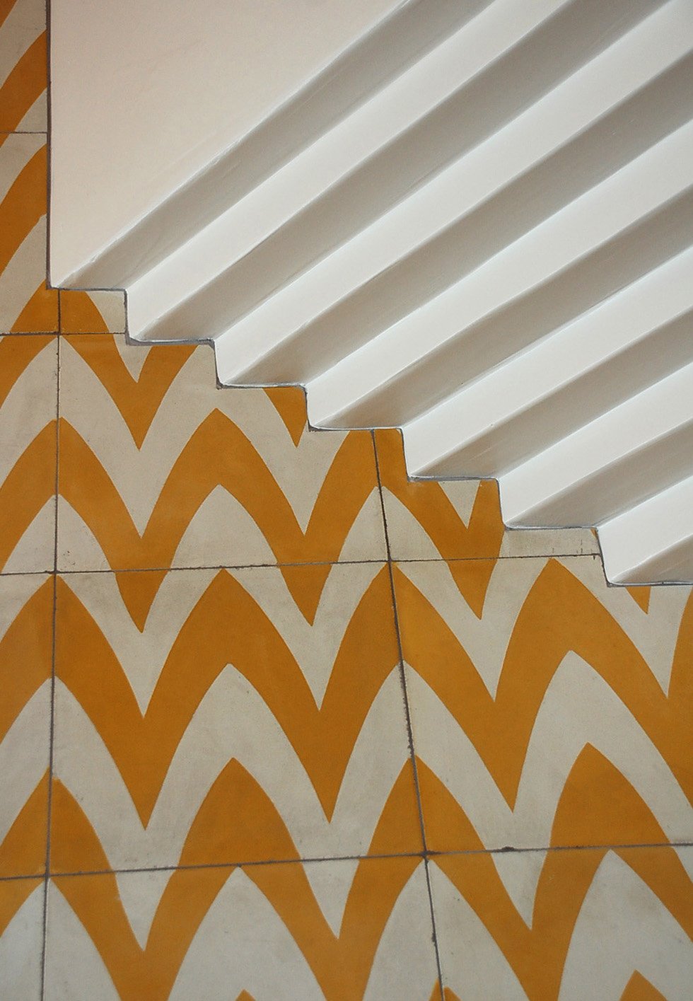
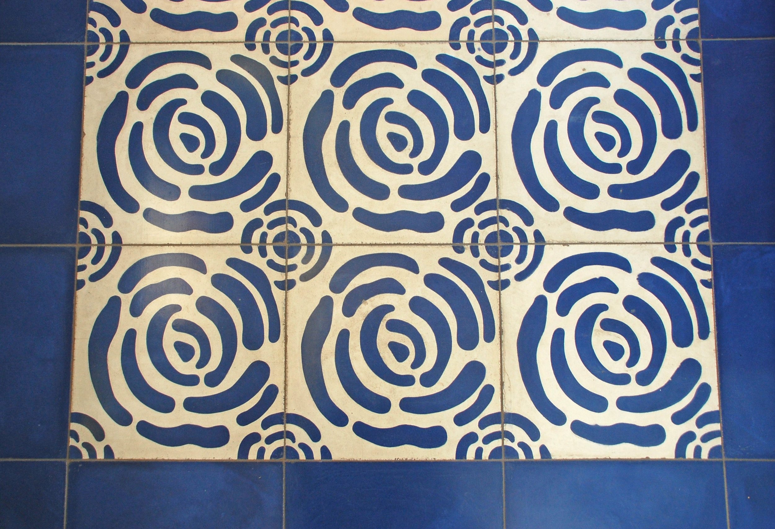
Tiles Below left to right: Snakes, Fish and Egg, Mattie's Rose Riser, Oil Spots, Pointed Arch, Pointed Arch & Paul's Flower, Mattie’s Rose & Stripe, Pointed Arch, Paul's Flower, Mattie's Rose, Elena's Flower, Circle. Tiles are available in custom colors at villalagoontile.com.
